Home stories: designing a galley kitchen, part two
Home stories: designing a galley kitchen, part two
Galley kitchens might be tight on space, but they need not be dull or unwelcoming because of that. In this series, we’re looking at two almost identical spaces (you’ll find the first one, Liz’s Chichester kitchen, right here) whose owners may have decorated in very different ways, but which are both brimming with personality as well as practicality.
Nigel is something of a Neptune kitchen aficionado, having installed three other Neptune kitchens in previous homes (you might recall the Chichester kitchen in his Ealing home, with its foxed glass and Morris & Co. wallpaper, which is also on our journal here). Each somewhat unexpected yet completely in keeping with the setting, this latest project was no different: a galley kitchen for a bijoux Cotswolds retreat, which Nigel shares with his partner, David. ‘While this is a beamed country cottage, I didn’t want it to feel predictably chintzy,’ explains Nigel. ‘Instead, I wanted to create an elevated, elegant space infused with rustic charm.’
Nigel turned to our Suffolk collection to achieve his vision ‘because it transitions very easily from a country look to a sophisticated vibe.’ While the cottage is Grade II-listed, he was able to make a few structural changes that allowed for the best use of the long, narrow space. ‘The original kitchen had a wood store at one end, so we opened up the doorway and now rather grandly call it the boot room,’ he tells us, laughing. ‘We also positioned the full-sized fridge there as it was too big to fit into the main kitchen space.’
An unused, low doorway to the garden was an original structure and couldn’t be removed, so the couple ingeniously turned it into a coffee station-meets-cocktail bar, fitting a shallow Suffolk wall cabinet at floor level, and installing underlit shelves into the nook created by the doorframe.
Elsewhere, they introduced various space-saving techniques to open up the two-and-a-half by four-and-a-half metre room. The rectangular Belfast sink was flipped sideways to fit the tight space, and the taps positioned at the side rather than behind the sink; an integrated bin was essential to streamline the L-shaped kitchen and the long, nine-hundred millimetre drawers were ‘a god-send: they fit all the pans and crockery and work incredibly hard.’ While the pedestal legs (rather than skirting) were a deliberate decision: ‘They make the cabinets look like pieces of furniture rather than a sleek fitted kitchen, which works in a property of this age,’ adds Nigel.
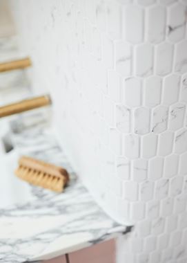
When it came to decoration, Nigel wanted something that would work with the beige and creamy tones of the heavily veined Arabescato marble work surface. The floor was a simple reclaimed pine from LASSCO with a light wash applied, and the cabinets, walls and timber cladding were finally painted in Zoffany’s ‘Faded Rose’ (‘The first pink we tried made it look like a three-year-old girl’s bedroom,’ admits Nigel).
And so, with the cottage project just about completed, the couple are starting to enjoy weekends in the country in their thoroughly elegant home with a dash of rustic charm, just as Nigel envisaged they would.
No matter how big or small your space, our designers can help you make the most of it. Find out more and book your first, free consultation here.


