Colour chronicles
Colour chronicles
From playing with brighter shades, to wall-to-wall deep, dark colour, and a new take on monochrome: here’s how to do three of the most exciting colour schemes right now in your own home.
Mustard vs not-just-any grey
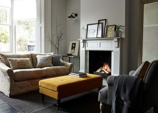
There are some colour combinations that just work. Brilliantly. Yellow and grey is one example – a shaft of positive warmth brings depth to a darker, more reserved tone. It was a colour combination made famous by mid-century fabric designers such as Lucienne Day and Sheila Bownas. These days, their winning mix is still going strong, but the yellow is a more mellow mustard than the Fifties-style lemon. Similarly, today’s versatile and flattering grey has also matured into a calmer shade. With undertones of warm blue and purple, it’s seen at its best in paint, such as our Smoke shade. In these freshest incarnations, yellow and grey are on-trend all over again, but in a brand new guise.
Get the look
There are two ways you can do this look at home. Try teaming our Mustard paint – a soft shade, a little like a mustard seed – with mid-grey Smoke. Or, use the Smoke paintwork as a backdrop for upholstery in Finch – our much brighter take on mustard. Either way, just think grey as your supporting cast and mustard as your protagonist.
The new monochrome
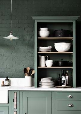
Contrasting black with white has always been the shorthand for sophisticated style. And it’s still the most effective way you can add impact to a mostly white kitchen or utility room, but the trick is to vary the proportions. A straight 50/50 split between black and white could make your home feel rather cold and office-like. Plus, it’s just too obvious and has been done far too many times before. Instead, tip the balance towards the purest white with a dash of black. A granite worktop, the dark lines of a powder-coated metal bookcase or even dark grout are easy ways you can achieve this. Or, for a moodier feel, reverse the formula and add the naturally pale striations of marble to dark kitchen cabinets and walls. The final ingredient in a monochrome scheme is texture. Reach-out-and-touch throws, grain-rich timber or natural wicker will break up the contrasts to make your space liveable and tactile.
Get the look
The kitchen is a high-impact space for this colour story. White-painted cabinetry, a white marble work surface, glossy white tiles (go for marble again to create real flow) and even white floorboards won’t look like too much if you go for a black range cooker and perhaps one or two black-painted chairs.
The dark ages
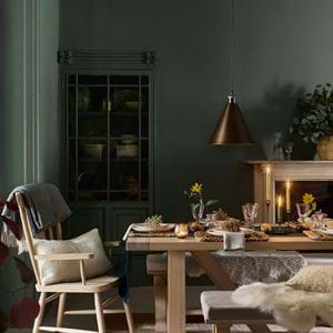
When interior designer Abigail Ahern first enveloped her rooms in walls of deepest, darkest blue, grey and even full-on black, it caused quite a stir. Several years on, it’s become the creative way to add drama and depth to a living space. But to make it work, you need great lighting and even better accessories. Invest in statement pendants that’ll stand out against their dark backdrop – gleaming metal and eye-catching glass are ideal. Team with table lamps, and furniture and accessories that can hold their own. Think upholstery in butter-soft leather or rich velvet and cushions in linen or softest wool. Pick out period details such as skirting or wall panelling in a deep, dark grey. If you don’t have original panelling, faux cladding is surprisingly easy to install. Then, to keep things cohesive, outline doors or window frames in the same inky shade. Finally, keep artwork low-key: the real work of art is already wrapped around your walls.
Get the look
Inky shades of blue and nearly-black grey are effective (try our Teal, Navy or Charcoal colours), but don’t discount greens and browns like Cactus and Walnut either – you don’t see them so often in interiors, so they can feel refreshingly different. Against that, consider moody-coloured furniture too with dark accessories to go with it – or be brave with bold brights. It’s as much about the smaller things as it is the big. Our, graphic, painted Aldwych collection is a great place to start and goes really well with similarly dark lamp bases and grey wool shades.


