Home stories: designing a galley kitchen, part one
Home stories: designing a galley kitchen, part one
If you ever thought a Neptune kitchen was best suited to a large space, then think again. In this, the first in our two-part series on galley kitchens, we speak to Neptune’s very own retail director, Liz, about her two-metre by six-metre Chichester kitchen and how small doesn’t mean difficult.
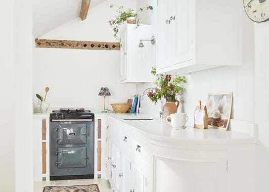
As Neptune’s retail director, Liz has seen many a kitchen installed in our stores around the country, so she had plenty of inspiration when it came to reconfiguring the kitchen of her 1700s terraced home in Malmesbury, Wiltshire. Her biggest challenge was the cottage kitchen’s small footprint. ‘Our stores are beautiful and big and could give the impression that Neptune is just for large spaces,’ explains Liz. ‘But I wanted to prove that Neptune can also work functionally in a small space and can look equally as beautiful.’
Liz had a few non-negotiables: she wanted a ‘baby’ AGA, good storage, and plenty of light – or at least the illusion of light. And while her role at work means she gets to see many impressive kitchen designs, the myriad of options also proved overwhelming when it came to her own project. ‘It’s harder to narrow down decisions because you see so many creative things happening on a daily basis at Neptune, so trying to pin that down to one choice was hard,’ reflects Liz. ‘But I decided to go classic, and as Chichester is our first-ever kitchen, I had to have it.’
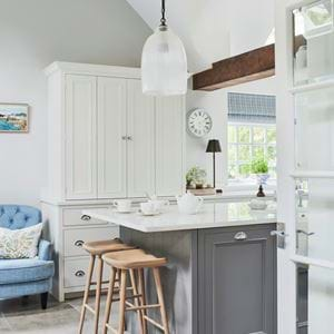
Liz sketched out her ideas to share with the Neptune kitchen designers (‘who very diplomatically came up with better solutions, like the curved cabinet’) and work began on the space in September 2021. The original kitchen had been very dark, so Liz installed a skylight and replaced the small window with double doors into the garden. She had expected to need bespoke cabinetry to fit the narrow room, but was assured by the designers that she could use standard sized cabinets without compromising the sense of space. ‘And they were right,’ she observes.
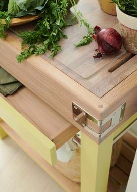
To keep the cabinetry feeling airy, Liz opted for pedestal feet rather than a filled-in skirting board at the base of the cabinets, and she used colour to create a sense of openness and space. ‘I painted the cabinets and walls in Snow, which meant I could introduce colour through freestanding pieces like the AGA and the butcher’s block, which is painted in Quince,’ says Liz. Flooring is the hardwearing Seaton sandstone. ‘I’ve got cats, dogs, and a horse, so I’m always waging a war with mud and fur,’ laughs Liz, ‘I definitely needed something practical.’
The installation in the Grade II-listed property went smoothly, despite the fact that ‘there’s not a straight line in the building’ and Liz was moving in by December. Six months on, and it’s the quality and finish of the kitchen that Liz notices most. ‘This is a worker’s cottage in a market town, so I didn’t want it to be too grand or fancy – I needed to stay true to its heritage, but every day I appreciate the quality and workmanship of my kitchen.’
Explore our kitchen collections and find out more about the design process here or in any of our stores.


