Ways with Quince
Ways with Quince
As we embrace the rituals and routines that a new season brings, at Neptune, this is also the time that we welcome our new seasonal colour to the collection. And this spring, it’s Quince: an uplifting blend of olive and warming yellow. Let us introduce you to the palettes that we think show it in its very best light.
Quince and Shell
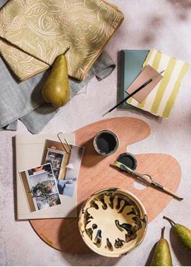
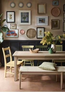
If you typically lean towards neutral shades to decorate your spaces, you’ll likely be looking to balance Quince’s chartreuse characteristics with something quieter, like Shell. By doing so, you can use Quince as boldly as you wish, softening the overall look with this neutral partner. To keep this pairing feeling contemporary here, try coupling the palette with our new Warm Black paint (or the sleek black lines of our Coniston collection), natural oak and black-bronze hardware. And in the kitchen, consider using our Henley cabinets in Shell (paired with black work surfaces, such as those from Dekton) as the base for your scheme, with a statement-making larder or island in impactful Quince.
Quince, Aqua Blue and Snow
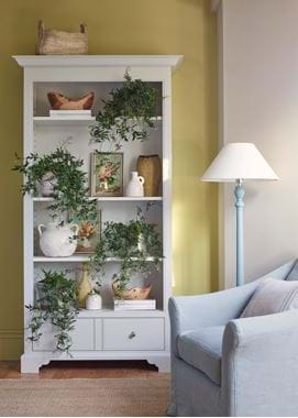
We’ve brought our cool Nordic paint palette together with Quince to create a combination full of alpine charm. The green notes in Aqua Blue are accentuated by Quince’s own green tones to create a balanced partnership. Used on the walls, Aqua Blue works well with smaller accents of Quince (think cushions like our Odette and painted lamps such as Highgate) and elements of Snow for a fresh and defined contrast. Our new Aldwych wardrobe in Snow, for example, would work well in a bedroom scheme in this palette. Alternatively, you could flip the balance, with Quince on the walls and the blues coming through in smaller ways. With textiles, for instance, try our Harry or Chloe linens in our grey-blue Mineral colour. Then if you want more depth, consider introducing a dark blue like Ink or Navy, or even the soft dusky pink of Old Rose (a colour that lends itself surprisingly well to ceilings). You could also try incorporating these accent shades by way of a soft throw or one of our new painted Jane McCall lampshades.
Quince, Saffron and Olive
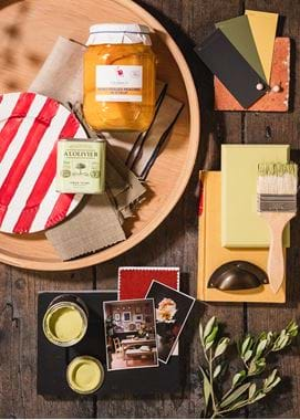
Quince is a particularly versatile and adaptable shade, finding natural matches with all manner of contrasting hues. It’s also just as happy to exist in harmony with other bold yellow and green tones such as Saffron and Olive. Saffron is our ‘true’ yellow – it’s neither pastel-toned nor too bright. Olive, meanwhile, is a traditional green with a yellow undercurrent just perfect for pairing with Quince. Together, these three colours create a joyful sunshine palette, improved only by the balancing presence of Ink, either on woodwork or walls. And for a scheme so rich with yellow tones, introducing a touch of red will add further character and contrast. We hand-painted red stripes onto one of our Croxton plates and hung it on the wall as a decorative piece – some food for thought for your own scheme.
Ready to start experimenting with these palettes? Order sample tins here.


