The spring edit: favourite new designs
The spring edit: favourite new designs
As we launch our spring 2022 colours and designs, we asked a few Neptune friends and interiors experts to reveal their favourite pieces. There’s nothing like a personal recommendation, after all.
David Nicholls, deputy editor at House & Garden magazine
‘The Aldwych wardrobe is one of those magical pieces that would work in just about any location – in town or in the country. And although I think it has a certain cool factor, it’s an elegant piece that you know won’t date.’
Fred, Neptune head of design and build
‘I love the Quince prints; they look great hung against a pale wall with the zesty colours of the painting contrasted with the blackened timber frame. Elegantly sized, the pictures can be displayed on their own or combined as a group of two or four to make more of a feature. The blackened frames will also highlight other darker design elements in the room, so work particularly well when paired with our Browning pendants or perhaps even black-bronze hardware on kitchen cabinetry.’
Ben Spriggs, editor-in-chief at ELLE Decoration magazine
‘I just love the new Barbury tiles created for Neptune by Wiltshire-based Marlborough Tiles – they’re the best of the best when it comes to creating decorative and glazed finishes for kitchens and bathrooms. The colours are just spot-on: take the Blakeney Blue and Saffron shades which sit together perfectly, or the Old Rose option which is delicate without being too pastel. The fact that they’re handmade means that every tile is slightly different, and you can use them in both traditional or more contemporary settings.’
Meaghan, Neptune stylist
‘I know Ben’s already chosen these, but my favourite additions to this season’s collection have to be the characterful Barbury tiles as well. We’ve been using them on photoshoots to create kitchen and utility splashbacks and bathroom feature walls. We’ve even framed a fireplace with them, laying the tiles in checkboard and graphic two-tone designs.’
Christopher and Sarah-Louise of @no.17house
‘We love the Quince dinner candles. Pair them with bold black candlesticks to add a pop of fresh colour to a shelf or tablescape. Just stunning.’ @no.17house
Emma Sims-Hilditch, Neptune’s creative founder
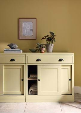
‘I recently painted our kitchen island and entrance hall in Quince. Having initially thought it was quite an acidic colour, I was surprised at how welcoming and uplifting it is. This shade would look amazing in a larder or pantry area too: green shades are particularly good backdrops in food prep areas as they will complement displays of fruit or vegetables. And the pigments in our paints are exceptional – decorators are always very complimentary about the coverage.’
Suzanne Imre, interiors journalist
‘Working from home often means my desk area shifts from kitchen to sitting room as the mood takes me. Unfortunately, it means the clutter and paraphernalia that goes with my work gets scattered everywhere. That’s why I was particularly taken by the mobile Heatherley desk organiser. With two beautifully jointed drawers, a couple of narrow shelves and a handy pen ledge, it’s an office set for those of us on the move within our homes. And thanks to its elegant low lines and natural oak finish, the Heatherley sits neatly on a dining table, console or even a dressing table when work is done for the day.’
Emma Paton of @emmapatonhome
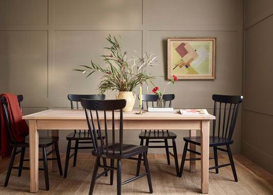
‘The Wardley dining chairs are that perfect blend of classic Shaker style and minimal contemporary lines that I always look for – a design classic! The gentle curves and craftmanship in the joinery are impressive and I love the idea of having a mixture of these in the new Warm Black finish, other painted colours and the lighter oak around my dining table to bring character and charm to the room. Perfect for family meals and gatherings. Warm Black would work well with both classic and modern room colour schemes too.’ @emmapatonhome
George, home designer at Neptune Fulham
‘As Emma mentioned, an exciting addition to our palette this season is our Warm Black paint. Already familiar from our Aldwych collection, you can now use it on all our other furniture and even your walls. I adore the deep, liquorice tone, and it’s a great colour to add a contemporary flair to interiors. Use it on an occasional piece of furniture to give it some weight, and position it against a light wall for a striking contrast.’
Explore more of the new collection online here, or pop into one of our stores.


