Colour scheming with Emma Sims-Hilditch
Colour scheming with Emma Sims-Hilditch
The colours we surround ourselves with can have a significant effect on our mood, so when it comes to deciding on the palette for a room scheme, there’s much to consider. Interior designer and Neptune creative founder, Emma Sims Hilditch suggests some perfect combinations.
Lively kitchen: Quince + Salt + Flax Blue
Quince is a yellow-green colour that, like all greens, works especially well in a kitchen because it brings a wholesome, healthy feel to a room. Try combining it with Salt, which is one of our softer whites, and Flax Blue which is equally as fresh and uplifting. Because it’s such an energising combination, this palette also works well in a home office.
Calming bedroom: Mist + Snow + Shell
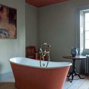
Family bathroom: Old Rose + Snow + Lily
Pink is a fun – and slightly unexpected choice – for a busy bathroom, but its flattering tones mean it’s a favourite at any time of night or day. It feels smart but not austere. Use the comforting, warm Old Rose on the walls (either in paint or with our Barbury tiles), paint the ceiling in Snow and use a neutral like Lily for the woodwork and joinery.
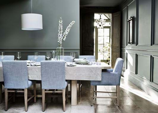
Panelled room or conservatory: Moss or Cactus
Painting everything in a room – the walls, doors and woodwork – in one colour feels both contemporary and cocooning, and is a useful way of making less-than-pretty features fade into the background. Moss and Cactus are cool green-greys that work well in all spaces and look particularly good with plants.
Study: Old Rose + Ink + Silver Birch + Snow
If you’d like your workspace to feel calm, soothing and dignified, go for Old Rose on the walls; paint shelves and storage in a strong, deep grey like Ink; use Silver Birch, which is a warm, creamy grey, on the woodwork; and finish with Snow on the ceiling.
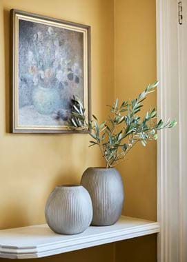
Entrance hall: Fog + Saffron + Shell
Country house palette: Honed Slate + Olive + Chesnut
This outdoorsy palette works particularly well in country houses or those where there’s a lot of natural wood and stone finishes. Experiment with the traditional mellow tones of Old Chalk on walls, ceiling and woodwork, then bring in a rich, dark colour like Olive on a dresser or upholstered piece. Finish with russet reds or oranges such as Chestnut as an accent.
Ground floor colour flow: Cactus + Moss + French Grey + Lily + Snow
Don’t think of rooms in isolation as often you’ll have vistas from one room to another and the eye should travel smoothly between the spaces. So, when you’re planning a redecoration, think about the flow and consider using analogous colours which are a group of hues positioned next to each other on the colour wheel; usually a dominant colour, say pale blue, then a secondary colour, say navy, and a third colour that’s either a mix of the first two or an accent, say turquoise. Think of the harmonious flow in Monet’s Water Lilies where the similar colours create a serene mood. Handily, all our core palettes consist of analogous colours making picking a scheme much easier. For a successful ground floor flow, try moving from Cactus, to Moss, to French Grey to Lily, and use Snow on the woodwork to pull the scheme together.
Discover all the colours in our paint collection online here.


