Choosing pendants for a kitchen island
Choosing pendants for a kitchen island
Kitchen lighting rests, largely, on the practical. Overhead, in cupboard and over counter recessed lights that illuminate the space well so you can do practical tasks easily. They need to be lovely for sure – warm and not too bright – but their métier is functionality. Island pendants, on the other hand, are where you can also bring style into the lighting mix. Opulence or minimalism, tradition or modernity, understatement or boldness. Oh yes, and they have to be practical too. There’s quite a bit to consider, which is why we’ve dedicated a whole journal to this kitchen lighting centrepiece.
Statement versus subtle
There’s no right or wrong answer. Just as your island can be a stand-out piece when painted in a different colour or it can feel like a cohesive part of your kitchen when in the same tone as surrounding cabinetry, so too can island lighting go either way.
When you might want to opt for a bolder light is when you want emphasise the statement that is your island. Take our freestanding Carter island, for instance. It’s already an eye-catching addition to a kitchen because its oak and blackened steel construction is so completely unlike cabinetry, and hanging our bronze Keats conical pendants above it emphasises that more because their material picks up on the island’s.
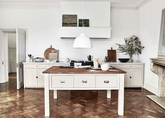
You can also use striking island lighting to draw the eye to other features of the room. The trio of large grey Byron pendants in our Ink Suffolk kitchen scene works to highlight the airy height of the ceiling. And the white one above the Driftwood Charlecote island might be subtle in colour but its size and singularity are a statement that plays up the symmetrical layout and centrepiece cooker hood.
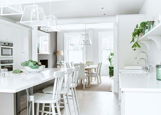
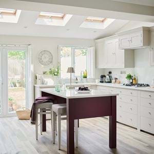
Going subtle, on the other hand, can still emphasise a room’s features, it’s just that this time those features are lightness and minimalism. When you have an off-white kitchen, for example. For this, choose pendants that are light in colour (white or nickel) and materials. Shaftesbury – both the original clear glass one and our new version with its ribbed design – is perfect, as is the Browning in Salt.
Finally, subtlety in island lighting is also your friend when there’s another aspect of the room that’s the star of the show. It could be wallpaper, a display on open shelving or a bold colour scheme (like in our Ink kitchen with the Olive island). Understated pendants will be happy to take a back seat here, meaning things don’t get too busy. Glass Shaftesbury is particularly perfect because your eye can just pass through it.
You don’t have to light in threes
It’s one of those things that’s bandied about a lot in the design world: that odd numbers, and particularly trios, are the most aesthetically pleasing. There’s absolutely truth in it. The asymmetry created by an odd numbered grouping is invigorating, especially in a space that’s already symmetrically arranged, and it’s more reflective of nature. A trio of pendants over an island also often works best because islands tend to be longer than they are wide, and this will give you an even spread of light across the whole surface.
But, there’s no denying that we humans like symmetry, and the general consensus is that it’s because we perceive symmetry as well ordered. In design, it’s also often thought of as more traditional. So, you might want to use just two pendants above your island to create a sense of calm or a feeling of classicism. More practically, two pendants or even one might be the better option for your island’s size and the amount of ‘stuff’ your room can take.
How to light an island and a table
When your dining table is in the same room as your kitchen island, things can quickly become visually messy if you light both with pendants, especially if they’re parallel to each other. Avoiding this is pretty easy though.
Your first option is to light one in a different style. Our cordless Hanover table lamps would be perfect. And we would lean more towards using these on your table and sticking with pendants for your island. Why? Well, firstly, the change in lighting height will create a change of pace that works better this way round: higher pendants, which light from above, will be brighter and more practical over the island, while lower lamps create intimacy at the table. The second is that lamps will get in the way on the working space of an island while pendants could glare into your eyes when you’re sitting at a table. And why Hanover? You could go with just candles at the table, which is certainly romantic, but that’s not so good for lighting up homework on a dark winter’s evening. Dimmable Hanover can handle both.
Your second option is to choose pendants for both island and table that complement but don’t compete. Pick two styles with something in common – nickel fittings, for instance, or a minimal aesthetic – but make one subtler than the other. Shaftesbury and Keats or the white versions of Browning and the smaller Byron are both pairings that work.
Don’t forget about the bulb
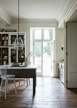
Sometimes, being able to see the bulb in your pendant light is a good thing. Pick a nice bulb and it can evoke a subtly vintage or industrial aesthetic. You’ll also get a wider cast of light when the bulb is more visible, which can be a great thing over an island which is often a very practical space. The clear Shaftesbury and Browning are both perfect for this, as is the wide, flat Keats.
Other times though, and especially when you also use your island as a seating space or if the pendants are hung lower, a visible bulb can be uncomfortably bright. The Keats conical pendant, Byron, Imperial and Tennyson are all better options here. Hughes, a fabric shaded pendant which includes a diffuser, is also perfect.
Or, if you want a bit of both – the lightness of a glass pendant but a gentler light – then go for the ribbed Shaftesbury. Its rippled glass will soften but not totally hide the bulb.
Rules to follow and to bend
When it comes to how high you should hang your pendants above your island, the general rule of thumb is to leave 55–65cm of space between the work surface and the bottom of the pendant. However, don’t just follow that blindly. Factors like how tall you are, whether you’re sitting or standing at the island and where the bulb is positioned in the light will all affect where you should place it. Too low and your pendants will be in the way (physically and visually), too high and they won’t feel like a part of the island (if you want a broad sweep of light, opt for recessed ceiling lights as well). If you need to, string up some cardboard cut outs to get this bit right.
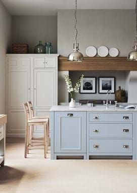
The other ‘rule’ is that the space between one pendant and the next should be one and a half times its width. But, again, don’t feel you must stick to that. As you can see, there are plenty of times when we haven’t. Like the Byron trio, whose closeness works because they’re placed at different heights to nestle in amongst each other and almost become one. Or the pair of nickel Imperial pendants above the Flax Blue Chichester island. They’re wider apart because that suits the open, airy and minimal feel of the kitchen.
Do what feels right for your space, the size of your island and what you find visually appealing, not someone else.
Explore our collection of pendant lights online here.


