When old favourites met new friends
When old favourites met new friends
If you’ve been with us a for a while, chances are you’ve heard us saying how we always design with timelessness in mind. Well, we also like to put our money where our mouth is, so we’ve taken a look back through our latest collections to pin-point the design partnerships that really demonstrate our commitment to timelessness – whether that’s a new piece paired with one we’ve been making for years, one that’ll sit happily alongside antiques, or even a new design with an old soul made modern with a lick of paint.
The Chichester workstation & a contemporary colour palette
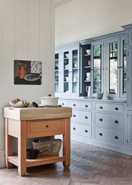
The first of our pairings shows how a more traditional piece that might have been in your home for some years can be reinvigorated by an unexpected colour palette that’s strikingly contemporary.
Our Chichester workstation is a true Neptune classic, not only part of our collection for a long time but also created in our signature English style inspired by Georgian and Victorian joinery. Between the moulding on its door fronts, the decorative skirting and cornice, and the tongue and groove back panel, it definitely falls into the traditional camp.
How refreshing then to update it in almost-black Ink and dusty Old Rose. And that’s the beauty of well-crafted timber furniture: it’s easy to repaint and, should you need to, repair so a well-loved timeless piece like this can go on feeling relevant for your home for years, if not generations.
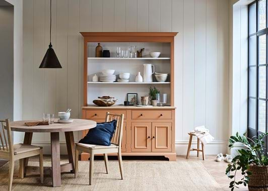
This pairing of classic furniture design and unexpected colour palette doesn’t just work with this piece either. Take a look at our Suffolk dresser in Ink and Burnt Sienna, or the Chichester chopping block and kitchen in Burnt Sienna and Flax Blue, for the proof of the pudding.
The Shepton cabinet & an antique table
Our next pairing is one that shows how brand-new pieces can sit harmoniously alongside the much, much older.
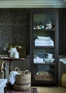
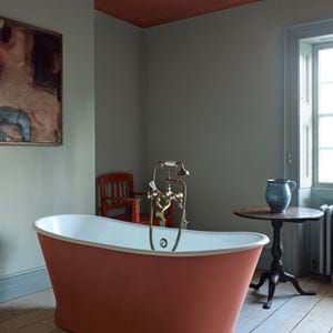
Antique designs were very often made using a real level of craftsmanship, with care given to the finishing from head to toe. So, when you’re pairing them with newly-made pieces, the combination will feel much more comfortable if your contemporary addition is just as considered. And it’s this heirloom-worthy approach to thinking that informs all our designs. Take the Shepton cabinet, for instance, which we’ve photographed in this bathroom as a linen closet – its finer details include timber zig-zag shelf supports (a feature borrowed from antique dressers), a stop chamfer on the outside edges of the frame (this is a groove that runs almost from top to bottom on the corners, stopping just short to create subtle shaping below the cornice and above the foot), and elegantly tapered feet, so it more than meets up to the standards of the antique table next to it.
The Larsson wardrobe & Wycombe armchair
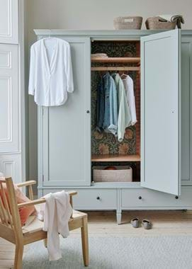
Although our new Wycombe armchair is inspired by Arts & Crafts furniture designs (specifically Morris & Co.’s Sussex chairs), it’s decidedly contemporary in style. The spindles, the rush seat, the low to the ground stance, all wouldn’t be out of place in a minimalist 21st-century setting.
The Larsson wardrobe, on the other hand, is all about ornamentation. It takes its cues from the Swedish Gustavian style, which in turn was influenced by the opulent decoration of Versailles. It’s peppered with carved details, including flower motifs at the corners.
What makes this pairing so successful though is how Wycombe is willing to take a back seat to Larrson. We’ve emphasised Larsson’s decorative nature by papering its back panel in a William Morris print (Pimpernel in Bayleaf/Manilla) and painting the rest in a stand-out combination of Moss and Burnt Sienna. It means that all eyes are on this piece, with understated Wycombe not competing for attention. Instead, it’s a lovely complement, subtly lending its modernity to the setting and echoing Larsson’s interior details in its oak frame and Isla Fox scatter cushion.
For another example of this in action, take a look at our Chichester dresser scene. Here again is a more traditional, more decorative piece that, thanks to its paint colour, is the focus of the room. And here too are minimal modern pieces (the Wycombe dining chairs and Arundel table) sitting quietly to one side.
The Highgate lamp & rustic country furniture
Now the Highgate lamp, although new to our collection, is a pretty traditional design. Especially when topped with a pleated linen lampshade. And, in theory, setting it on an antique console table next to a painting found at a vintage market and against an aged and mottled wall sounds like a story only of tradition. But not so.
In this situation, as with the Chichester workstation, it’s Highgate’s painted finish that’s the main modern feature. But what’s happening here is that the smooth, perfect finish and vibrant Aqua Blue colour are visually cutting through all the weathered features of the scene. Like a squeeze of lemon on your cooking.
The Alconbury vase and tealight holders are playing a part too. Even though their finish is also mottled and matt, what they bring to the table is their contemporary form, and so a further element of balance.
For more ideas on combining the new and the old, visit any one of our stores.


