Design advice for living room layouts
Design advice for living room layouts
Living rooms are often one of the trickiest rooms in the home to design, because they’re usually the one that multi-tasks the most. Somewhere to watch the telly, somewhere to relax, somewhere to entertain friends, somewhere to store all sorts of paraphernalia, and even somewhere to eat and work depending on your setup. Paint colour, fabric choice and flooring aside, what to put in your sitting room and where to position it all are two of your main considerations. If you’re wondering whether there are any clear dos and don’ts of living room layouts, keep on reading for our interior design advice…
Find your living room’s focal point
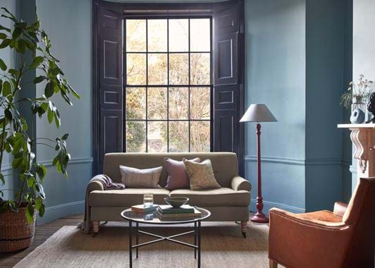
Deciding what the key item in the room that you want to draw attention to is one of the best places to start. If you have beautiful views from your window, frame it with a noticeable window treatment like floor-length, fully-lined curtains or a linen and velvet Roman blind, and position some of the seating facing it if possible, or put an armchair or footstool beneath it. If your living room is going to double as a home cinema, then make a feature out of the screen. Otherwise, we always suggest concealing the screen behind a mirror or dresser doors. If your living room doesn’t have a focal point though, then create one – it can be a rug, a piece of art or a dominant piece of furniture, and will act as an anchor to your scheme. Its defining feature. Arranging your furniture in a U-shape around the focal point is a good tip for emphasising it further.
Start in the centre
If your living room’s on the smaller side, it’s tempting to put all of the furniture against the wall to make it feel bigger. This actually just creates an empty space in the middle which isn’t as usable as you might think and leaves your room feeling off-balance. Instead, in any size room, build your layout from the centre to make it feel more intimate and welcoming.
Try zoning
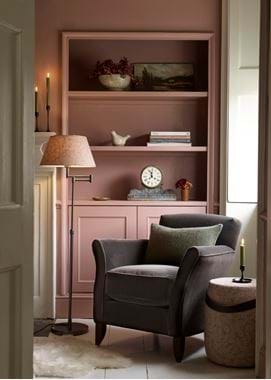
Focal point decided, centre point filled, it’s time to think about how to lay out the rest of your space, which is where zoning comes in. Most sitting rooms have the sofa, or sofas, at the centre point, which is by virtue your main relaxation area. If that’s your only seating spot, you might need to bring any coffee or side tables closer in. Maybe you have a secondary seating area if your room is large enough – a cosy reading nook in the corner with a floor lamp and side table to rest a cup of tea and upturned book. Do you want to include a work desk in another area? Or have you gone open-plan and need to section part of your living room for a dining area? Figure out what zones you want, rank them in order of importance, and start to map them out on your drawing to figure out what you actually have room to do.
Save on space
Think carefully when it comes to furniture and only invest in what you really need or really love. You might not necessarily need a television stand, a footstool might be able to double up as a coffee table. Overfilling your room makes the layout more complicated and in turn, your room will feel smaller.
Think about traffic
You’ll naturally have one or two paths around your living room and it’s up to you to determine them when deciding on layout. How are you going to move around the room? Is there anything that’s going to get in the way and become a daily annoyance? A good rule of thumb is:
- To leave three feet of space in ‘high-traffic’ areas and your main walkway so you don’t bump into any furniture.
- Leave 15-18 inches between upholstery and a coffee table or footstool.
- Only put furniture at an angle if you’ve got lots of room to spare.
Get drawing
One of the most helpful ways to figure out your layout (as well as if something’s going to fit or not), is to get a roll of paper (even baking parchment will do), a pencil, a tape measure, and invest in a scale ruler. Scale rulers are a favourite tool amongst interior designers because they easily let you take your room’s measurements and draw them up in shrunken down (but to scale) form. On the triangular ones, there tends to be two scales on each side. 1:20 or 1:25 are likely to be the biggest; have a play and see which you want to use. From there, draw out the exact measurements of all of your furniture too, using the same scale. Cut them out, and then you can use them as little templates to fill in your room’s outline and see what fits and what layout works best. Think about traffic when you’re doing this too.
Ask yourself, what atmosphere do you want there to be
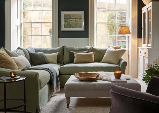
There are all sorts of things that contribute to your room’s ambience, from your choice of furnishings to music and lighting. Layout has a role to play too though. Matching sofas that are facing one another with a coffee table or footstool between is generally thought of as being the most formal of layouts. It also reiterates that television viewing isn’t the be all and end all. Swinging your sofa lengthways with armchairs at either end in a U is more of an expression of ‘curl up, get comfy and watch a good film’.
Your textiles will help you to determine a room’s mood and message too. Something as simple as a large rug with your seating on top draws attention to the cosiest part of the room and makes this zone the focus. But, let that rug spill over into your dining section, and it feels more informal and encourages people to move from zone to zone. The little things can make a big difference, even if you feel like nobody might notice, they most certainly will.
For more living room layout ideas, visit your closest Neptune store to speak to a home specialist or to see how we’ve laid out our in-store sitting rooms.


