Reading a room
Reading a room
Interiors expert and former Livingetc editor Suzanne Imre explains how to read the proportions of your home – from ceilings to skirtings – and how they impact on the feel of a space.
Exploring stylish homes has been a big part of my career and whenever I’ve come across a particularly successful interior, I can’t help but notice that it is usually an essay in balance and harmony, where the room’s proportions have been carefully considered way before the fabrics and rugs and accessories have been chosen.
Now I’m the first to admit that interior design is never ‘one rule fits all’, as every space has unique attributes – some of which can be highlighted and others that definitely need disguising – but over the years, I’ve realised that reading and understanding a room’s proportions, is the first step towards a rewarding decorating project.
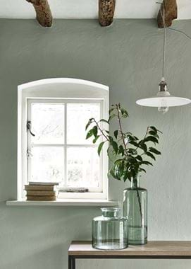
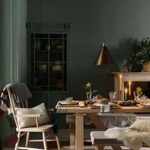
Room height is the first thing to take into account when reading a room as it can vary by almost half a metre depending on whether you are looking at Georgian proportions or modern builds. Glorious, soaring ceilings mean large windows, grand scale and elegant proportions. But such supermodel credentials have their challenges too – art can look dwarfed in a tall room and window treatments need to be carefully thought through. You can solve this by hanging art high on walls (either one large, portrait style image or a collection of smaller prints leading the eye upwards), while curtain treatments for tall windows should be hung from the ceiling, never from the window (to avoid the upper walls feeling cold and empty). I’ve also seen light shades, suspended from the rafters and hung low over tables, used to visually connect the ceiling and lower areas and prevent the space feeling chopped up.
I tend to think of low ceiling rooms as unashamedly cosy, and they can take a surprising amount of detail, just think of the allure of a low-roomed, country cottage with original stone or panelled walls. But even the cutest of compact rooms shouldn’t feel crowded. You can create a sense of space by employing an optical illusion and go for lower-level furniture, while taking door frames up to the ceiling and choosing wall lights that will flood the walls with soft colour, rather than space-grabbing, overhead pendants.
Your room’s proportions also impact when it comes to wall detailing. Deep skirting (and I’m talking a generous 30cm) and ornate plaster coving are perfect in high-ceiling, Victorian or Georgian rooms but more compact rooms need a slim-line skirting and simple coving. And cottages with plaster or stone walls often look best with no skirting or coving at all.
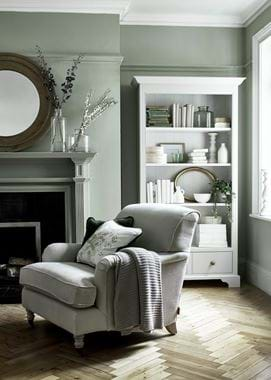
Dado and picture rails will also visually affect the way you read a space, so dealing with them creatively is key. I’ve tried painting dado rails in white or a contrasting colour to the wall, to make them a focus which works if the room is lofty and needs breaking up, but I always hanker for more height in my home, so my favourite trick is to paint dado and picture rails the same colours as the walls, making the details subtly disappear and the room feel taller – I even include the skirtings to add extra inches.
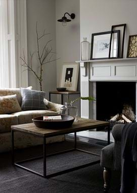
Fireplaces are often the focus of a room and have a big impact on the feel of a space. There are regulations on the minimum height of surrounds to take into consideration, but also think about how your fireplace will be viewed. I’ve learnt from experience that if you have seating pulled close to the fireplace, make sure the view, while sitting, is a pleasing one rather than a dusty angle of a sooty flue! And ensure the size of the fireplace and surround are in harmony with the space – nothing makes me more uncomfortable than a room where the fireplace is looming over the furniture like a great big, unwelcome guest – unless of course, it is an original inglenook in which case you’re allowed to break all the rules of proportion!
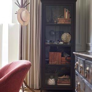
Storage is the holy grail in my home and so it is a huge relief when I can incorporate into my plans without it dominating or even appearing to take up much precious space. The trick is to build storage that feels like it is part of the walls of the room. Filling a recess, or an entire wall, with sleek, fitted cabinetry not only gives you lots of lovely storage, but the eye reads the units as part of the wall and so they don’t alter the feel of the room.
Last but not least, window treatments can have a big impact on a space. I like to think of windows as picture frames on the scene outside, with shutters to provide privacy when needed. But if you want to use curtains, just remember there is only ever one star in a room, so if your floors or walls or furniture are patterned or decorated, keep those window treatments neutral! As the most successful interiors know – its all about balance and harmony.


