Style spotlight: cool, classic white kitchens
Style spotlight: cool, classic white kitchens
The best ‘trends’ are the ones that don’t fade away; it’s what differentiates a passing fad from something here to stay. The magazines might be reporting that white kitchen cabinetry is having a moment, but just like the crisp white shirt, the classic white kitchen never falls out of style. Need convincing? Read on. Agree? You best read on too…
The look: defined
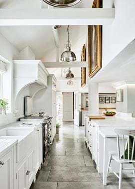
The key behind this look is the interplay between contemporary-cool mixed with a degree of tradition.
There are so many white kitchens out there that are all of one, or all of the other. Ceiling to floor, high-gloss cabinets stood on poured concrete floors with minimal ornamentation is one example. White cupboards with wooden countertops, matching knobs and oak floorboards is another. Don’t get us wrong, we love them too, but this look is more about a bit of both. Not too contemporary that you enter ‘fad’ territory but not so traditional that it feels staid and done before. There’s an equilibrium somewhere.
B is for balance: the rule book
Rule #1: begin with tradition. Stick to classic craftsmanship and opt for solid timber cabinetry. This should always be your starting point for this look.
Rule #2: work surfaces or floors, rarely both. Choose either sleek worktops and a traditional floor or inverse it. Ceramic surfaces are ultra-chic and work with slate, limestone and wooden flooring. Or if your heart’s set on oak on top, balance things out by choosing a more modern tile underfoot or doing one run in a different material like quartz. Don’t forget, there’s always marble which occupies that middle space. Honed or polished, it always looks beautiful and carries no label.
As for walls, white herringbone tiles are very of-the-minute and metro tiles are here to stay, and neither looks too try-hard. White grouting keeps the colour commitment consistent, black is a little bolder, or grey is a rather lovely middle ground. Alternatively, there’s simple paint or wooden wall panelling (which, in the case of our Cranbrook, also looks fabulous on a ceiling).
All traditional can look flat, and all modern often doesn’t always end up looking modern. A carefully chosen mix of old and new looks the most tasteful of all, not to mention timeless.
Rule #3: paint. White as a colour has become more exploratory. Some whites are cooler with subtle blue tones whereas others have a pinkness to them which is much warmer (the latter being akin to classic schemes). In our paint palette there are colours like Snow, perfect for a crisp, contemporary statement; Shell is also a good option which has a little more shade to it, as does Salt; whereas Silver Birch is a better choice for homes looking to find tradition through colour.
One thing worth remembering is that white has also become much more of a contrast point. It gives us an opportunity to play with fabulous colours, like painting one statement wall that can be updated as the seasons change. Ironically, white allows for a lot of colour. If you want it to.
Rule #4: staples don’t have to be safe. There are your classic white staples like the butler’s sink, which has grown and grown in popularity, but also new sink ideas like those fashioned from white marble so the entire kitchen work surface becomes a bed of solid stone. Done well, it really is quite breath-taking, and certainly falls on the cool side.
Appliances have the potential to take your white scheme to the upper style echelons. The ultimate has to be a bright white range-style cooker, although stainless steel works nicely too and breaks up a sea of white. Next, think about achieving balance through traditional electrical pieces like kettles and toasters, and adding in the coolest of gadgets by their side like juicers and hi-tech food processors. KitchenAid and Delonghi have been doing it particularly well recently, while Dualit is ever classic.
Accessories come into this too. Again, if you want to go down the pure white route you can absolutely do that with white accessories, or you can introduce pared-back colour. Artisan earthenware in white always looks really lovely and is a half-way house between traditional and of-the-minute designs. They have an imperfect quality and tumbled texture that brings some variation to a scheme.
Hardware, too, can make a big difference. Brass handles and white cabinets look incredible together and give an almost Ottolenghi look, but can easily be changed and updated.
Rule #5: look forward, not back. We end things by looking at cool, and cool alone.
Cool to us means not only do you enter a kitchen and think ‘wow’, but when you use it, it should feel utterly special, effortless, and even a little clever.
Keeping work surfaces as clear as possible is an easy yet impactful way of doing this. It means there’s not too much for the eye to focus on, lets the beauty of the cabinetry and worktops really stand out, and makes your kitchen hassle-free to live in. By selecting what you have on display with real care, it also means those few accessories will really define your space. Choose wisely and pick intriguing cookbooks, one-off chopping boards and vintage scales that you want people to notice and to be more than a pleasure to use. In terms of usage, indulging in a range-style cooker adds instant ‘cool points’, as does challenging convention by setting the hob in a different space away from the cooker. If you place it on a kitchen island, it makes entertaining and cooking a seamless exercise. Finally, there are the things that you don’t really think about. Opening drawers to find a surprise spice rack, pulling open a bin cabinet to find a hidden drawer just for storing bin liners – it’s all those little things that make us think ‘that’s kind of cool’.


