Ways with green Walls, furniture and flourishes
Ways with green Walls, furniture and flourishes
Green, so abundant in nature and so associated with positive feelings of calm and vitality, is one of the easiest colours to use in the home. And most of us do, perhaps without even realising it, when we decorate our interior spaces with houseplants. But how about using green on a grand scale? By being brave and decorating with it top to toe, we can really reap the benefits of its tranquil influence, as these three looks show.
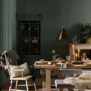
1 Dark & adventurous
Bold, brave and utterly beautiful. This is a room that takes the fear away of using green in a big way.
The George sofa: this design is a bit of a showstopper all by itself, but with verdant velvet upholstery in our Mallard finish it becomes something quite extraordinary. Velvet is also rather brilliant at bouncing light so, despite its deep tone, it still manages to brighten.
Timber: it’s no secret that green is the colour above all others that’s intrinsically linked to nature and the great outdoors. So by anchoring your interior with one or two wooden components, such as our solid oak Arundel dining table, you’re able to make that link to nature that bit stronger. The table becomes the bark of a tree, and the sofa the foliage.
The backdrop: furniture is only part of the story. Get creative and make your own backdrop as we’ve done here by creating an ombre effect on canvas (or directly onto your wall). Here, we stretched cotton canvas onto a wooden frame and started by covering it with a basic wash coat. From there we applied wide brush strokes of colour, applying the lightest all the way down and then building it up with dark paint from the bottom. We’ve gone one step further by filling the space with luscious plant life from floor to ceiling. Choose a variety so the texture and tone of the leaves aren’t a constant, and mix up your planters from wicker to zinc.
The setting: be adventurous and put furniture into unexpected contexts. Here, we’ve proposed the sofa as a decadent dining chair alternative. And the room? It’s a wonderful melding of living room, green house, conservatory and dining room. It blurs the lines between our interior and exterior worlds.
2 Light & bright
Just like velvet, our Sage paint reacts to light beautifully. Brightening up, achieving a touch of crispness, but remaining softly spoken too.
The Suffolk dining table: with the rounded contours of its turned legs and smooth oak surface, this is one of our dining table designs that will always soften a scheme. So if you’re looking to introduce green in a quieter way (as we’ve done with Cactus painted legs), using it on a design like Suffolk is a safe way to go.
The textiles: soft is a word that we’ll keep coming back to with this setting. But if you look closer, there is in fact very little literal softness. There’s the Chatto armchair laden with cushions that peeps from behind the door. Otherwise, the only textile to be seen are the dining chairs’ loose covers. We chose the Long Island design because loose covers are so abundant in softness that little more is needed. They feel light, airy and are yet another way to bring in a subtle touch of green thanks to the Emma Sage floral print (please note that our Emma Sage fabric has changed slightly since this photo was taken, and the pale green print now comes on an unbleached, off white background).
The walls: there are three focal points to this room, and this is the third. From the beams to the bricks, we’ve painted all of the vertical aspects of this conservatory in our Sage paint. If someone were to describe a room being painted with doors, door frames, window frames, walls and ceiling in green, and then more greens to be repeated on the dining table and referenced on the chairs, you may have found it hard to believe that it wouldn’t be too much. But what about now?
3 The new classic
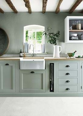
From country styled settings to pared back contemporary, or even somewhere in between. Green is an all rounder, and our Henley kitchen setting shows you how.
The cabinetry: green in the kitchen is becoming all the more popular. And while we adore the dark green and marble contrast (see our Suffolk collection as an example), using Sage is the perfect choice if you’re looking to make more of an understatement. It will always carry a degree of provinciality to it, but you can tone it up or down. Here, we may have used oak work surfaces and flagstone floors, but we’ve shown how a Sage kitchen can edge more towards the modern country end of the design spectrum. It’s pared back and makes us think of words like ‘craft’ and ‘artisanal’.
The walls: Sage on Sage works. We saw that in the look above, but we see it again here in a very different way. The room is smaller, there’s much less light, the ceiling is low and the beams heavy. And there’s less to break up the pairing. There are two key reasons for its success: the rough plaster skim beneath the paint to bring texture, and the fact we haven’t tried to take away the green focus. No paintings, no wall lights, no distractions. It’s green and it’s proud.
The textures: the plastering is where the texture begins. From there, let your eyes travel to the linen tea towels and napkins, the smooth and glossy Belfast sink that’s mirrored in the jug vase, the wire egg basket, the solid oak work surface, the timeworn timber beams and aged breadboard. And on a much less obvious scale, the hand-painted finish on the cabinetry and furniture and the visible brushstrokes mean not a single element of the room is flat.
The accents: white is used sparingly in this scheme to offset the green tones in a carefully measured portion. The sink and jug, as we touched on above, have a secondary role to play, as does the touch of white on the wall cabinet and the window frame. And, in case you hadn’t spied them, there’s a single row of our pearly white Elcot tiles that deserve their bit of credit too.


