On Pantone’s 2021 Colours of the Year
On Pantone’s 2021 Colours of the Year
This year, as they have been doing since the first year of the new millennium, Pantone have selected their ‘Colour of the Year’ – a prediction for the direction of design, fashion, interiors and the general zeitgeist in 2021. We asked Kassia St Clair, author of ‘The Secret Lives of Colour’ and regular Stories contributor, to share her thoughts on what has been a rather divisive choice.
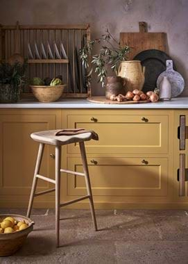
Late last year, Pantone announced their Colour of the Year for 2021. Since it seemed likely to be an unusual year, the choice was unusual too. It would be a pair of colours, something they had done only once in two decades of selection. The colours chosen were Ultimate Grey (17-5104), a mid-grey akin to wet concrete, and Illuminating (13-0647), a sunshine-bright yellow.
In the press releases and statements accompanying the announcement, the forecasters emphasised that the colours be seen as a unified whole. “A marriage of colour conveying a message of strength and hopefulness that is both enduring and uplifting,” was the tagline. Leatrice Eiseman, an executive director at Pantone, said that the union of the two “expresses a message of positivity supported by fortitude,” simultaneously “rock solid” and “warming”. The reception the choice received was less than rapturous. Vogue called it “tone-deaf”, “half-hearted” and “really weird”.
The past year has been a difficult time to be in the prediction business, which is what, in effect, Pantone’s Colours of the Year are. They look ahead and try and match the mood of the moment, guessing what it is we’ll be looking for over the next twelve months. 2020’s Classic Blue was heralded as highlighting “our desire for a dependable and stable foundation on which to build as we cross the threshold into a new era.” This was announced on December 5th 2019 and Pantone have since claimed that subsequent events made Classic Blue especially prescient; I will leave you to make up your own minds on that.
As a prediction, Pantone’s 2021 colours look like a hung jury. Despite the injunction that they should be viewed together, this is incredibly difficult to do. Aesthetically, they’re unhappy bedfellows. Even Pantone’s own promotional shots struggle to combine them satisfactorily, drastically favouring one shade over the other. Looking at the two symbolically only makes the job more difficult. Illuminating, on its own, is a wonderful colour. Redolent of mimosa, buttercups and golden-hour sunlight, it could be the poster-colour for optimism, confidence and happiness. Imagine the filter movies often put on treasured, childhood-memory sequences. The problem is Ultimate Grey, the harsh to Illuminating’s mellow. Pantone likened this one to the colour of pebbles on the beach, which would indeed be wonderful, but Ultimate lacks the subtle undertones of something natural. Instead, it has a distinctly computer-generated look. A colour best expressed in runs of 1s and 0s rather than words. It’s gloomy: think itchy sweatpants, car parks and institutional linoleum.
This is a shame and, since Pantone have never chosen a monotone before, rather a missed opportunity. It’s no secret that greys have enjoyed a surge of popularity over the past decade, in part because they encompass multitudes. Think of the darkling-violet of storm clouds, through bright Cornish mizzle or deepest slate to dove down. All greys, but with different looks and feels. All, however, are greys you could live with. Ultimate, on the other hand, is the kind of dull, linear, shade that gives greys a bad name.
Indeed, the more you look at these colours together, the more Manichean contrasts suggest themselves. Sunshine versus shadow; nature versus technology; optimism versus resignation; extroversion versus introversion. Perhaps that is what makes this odd-couple choice so unsettling. While the intention may have been to choose a pair that marries positivity with resolve, endurance with vivacity, it is impossible not to see in Illuminating and Ultimate Grey two possible futures, one a good deal more appealing than the other. This is why I intend to ignore Pantone’s strictures to think of them together. I would rather dispense for the moment with the shade reminiscent of sweatpants and existential dread and focus solely on Illuminating. Perhaps I may select a grounding accompaniment of my own at some later stage; perhaps not. For the moment, what I need is a good dose of the colour of summer holidays – remember those? – friendship, joy and, crucially, hope.


